The Public Walkways
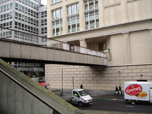 |
"The building will incorporate a riverside promenade and public walkways at first floor level" |
Upper Thames Street is a very busy wide road, which isn't easy to cross on foot. This could explain the provision of the pedestrian walkways at first floor level.
The Public Walkways
Close up, Mondial was a 'concrete castle', rugged construction, sturdy walls, seventies styled. Even the name was cast in concrete, in keeping with the patterned walls of the perimeter:
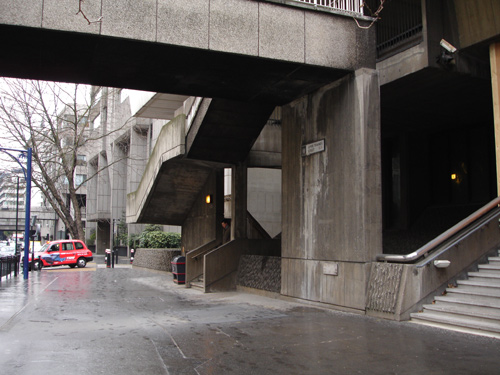 |
The public walkway descends to Upper Thames Street, close to the entrance of Mondial House. |
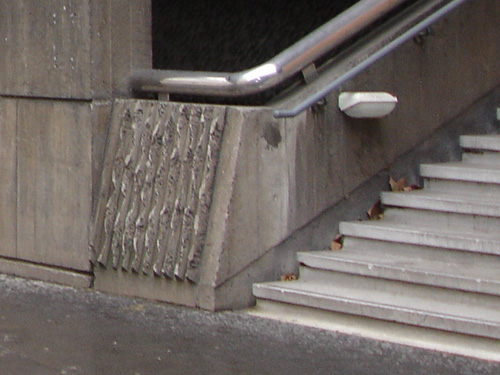 |
The rugged design of concrete walling reminds us that this was very much a 1970's building. |
 |
Mondial is a French word meaning 'world-wide' and is correctly pronounced as 'Mondy-all'. This was a very apt name for an international telephone exchange which made world-wide communication possible. |
 |
At ground level, the main entrance was via a staircase. At the time of building, no provision was required for disabled access. The concrete wall surrounding the perimeter made the building look somewhat like a fort and the ground the other side dropped away to the start of the basement levels. |
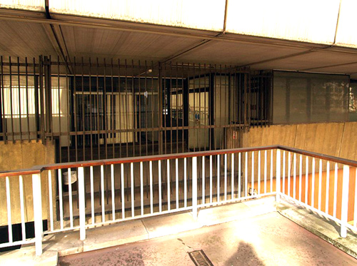 |
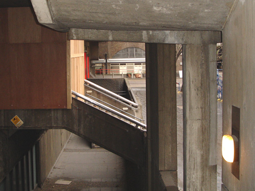
In this photo, the public walkway can be seen to have at one time extended into the building, but in later years had been securely barred from access. |
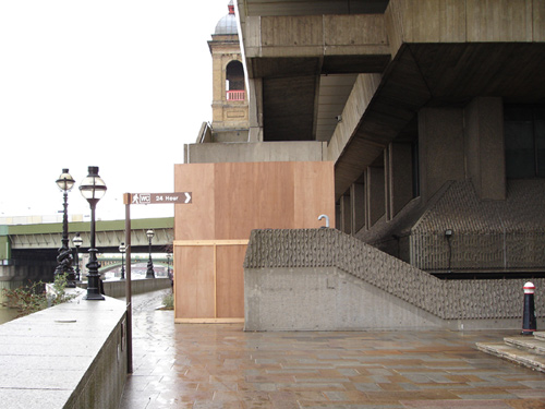 |
The internal walkway around the building, at first floor level, descended via these concrete stairs (shown boarded up) to the riverside promenade. |
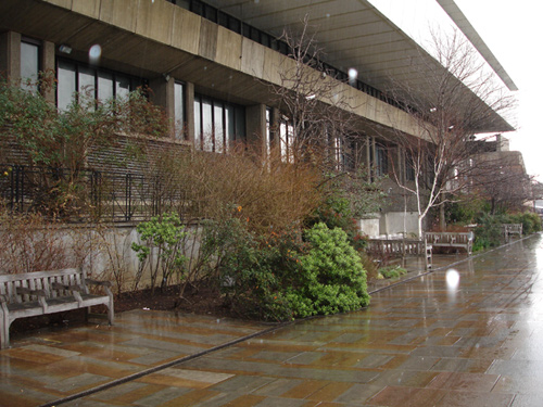 |
The public walkway alongside the Thames was thoughtfully laid out with benches, trees and bushes and the shear bulk of the building was not so obvious. However, the large ventilation inlets/outlets suggested that this was an industrial building, and wouldn't be mistaken for a riverside cafe! |
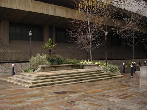 |
One side of the building was laid out with coloured paving slabs, street lamps, traffic bollards, trees and bushes, attempting to diminish the impact of such a large structure zig -zagging above. |
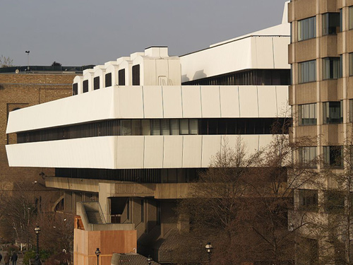 |
Several floors above, the white cladding (despite its age) gleams in the sunshine and the cooling pods can be clearly seen. |
All logos and trade marks are the property of their respective owners and are used on the Light Straw site(s) for review only. Students and researchers are recommended to make their own independent enquiries as to the accuracy of the information contained therein.